E-Commerce & Conversion
High-Yield Product Detail Page (PDP) Architecture: Social Proof, Trust Badges & Cross-Sell Uplift Boosting Add-to-Cart by 45%
Why 85% of Paid Google Shopping and Meta Catalog Traffic Bounces Directly from Your Product Page
In modern e-commerce, the store homepage is no longer the primary entry point. Over 78% of commercial paid traffic from Google Performance Max (Shopping) campaigns and dynamic Meta Catalog Ads lands directly on the Product Detail Page (PDP). That is where store owners face a painful unit-economics leak: ad campaigns drive thousands of high-intent clicks for specific SKUs, yet the Add-to-Cart (ATC) rate stagnates at 1.2%–1.8% instead of the 6.5%–9.5% industry benchmark. When founders search for pdp conversion rate optimization, they often tweak button colors while ignoring structural UX flaws.
According to benchmark research by the Baymard Institute across top US and European retailers, 58% of e-commerce websites have a mediocre or broken PDP user experience: 43% fail to display shipping costs on the product page, and 44% bury return policies in footer links. In this engineering guide, we break down high-margin ecommerce product detail page design, examine how product page social proof badges eliminate buyer hesitation, prove the math behind cross sell up sell ux best practices, and demonstrate through 4 portfolio case studies how high converting ecommerce gallery ux lifts Add-to-Cart rates by 45%+ and expands Average Order Value (AOV) by 20%–28% on existing ad spend.
The First 3 Seconds on a Product Page: 3 Questions Shoppers Demand Answers to Instantly
A shopper clicking a Google Shopping ad at $0.80–$1.50 CPC has already seen your product thumbnail and base price. Within the first 3 seconds of landing on your PDP (Above the Fold), their brain scans the Buy Box to answer three non-negotiable questions: 'Is my exact size or variant physically in stock right now?', 'What is the true total cost including shipping, discounts, or BNPL installments?', and 'Is this store safe to buy from if the item doesn't fit?'.
1. Buy Box Visual Hierarchy and Exposed Tactile Variant Swatches
The most common conversion killer in off-the-shelf Shopify, WooCommerce, and OpenCart themes is a cluttered Buy Box paired with variant selectors hidden inside native `<select>` dropdowns. Forcing a mobile shopper to tap a dropdown just to check if Size M or a specific finish is available adds friction and hides inventory depth.
In our engineered ecommerce product detail page design, we enforce the Exposed Tactile Swatch Rule: all sizes, weights, colors, or material grades are rendered as visible, single-tap pill buttons. Out-of-stock variants display a subtle diagonal strikethrough with an instant 'Notify Me' trigger, while clicking any active swatch updates the price, SKU, and hero gallery in under 30 milliseconds via optimistic state updates without reloading the page.
2. Case Study — Luxury Life: High-Ticket Trust Architecture Above the Fold
First-impression clarity is especially critical in high-ticket verticals—fine jewelry, watches, luxury apparel, and custom electronics—where buyers hesitate over sizing accuracy and return guarantees.
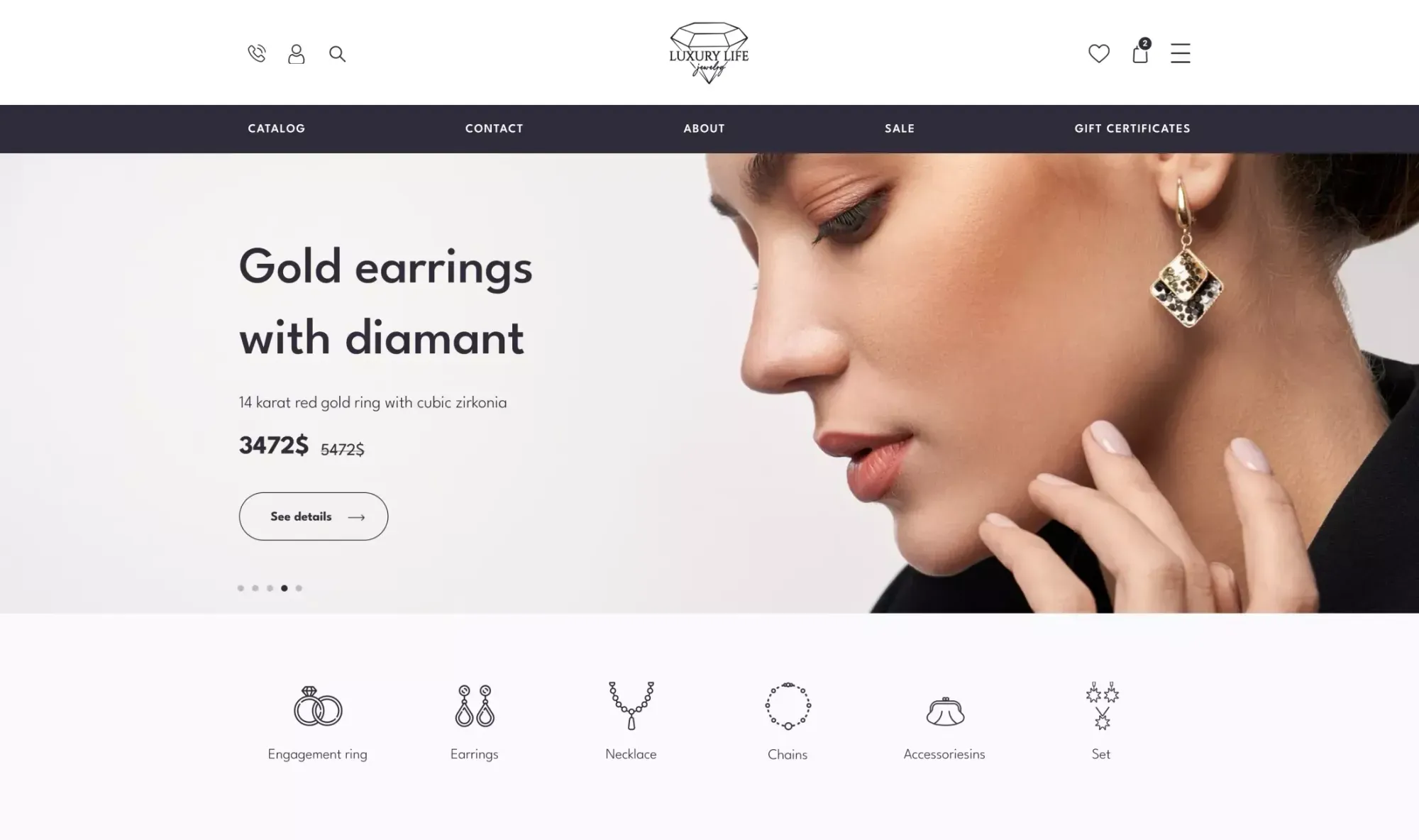
When designing the Luxury Life online jewelry store, we architected the above-the-fold Buy Box around total transaction transparency. Next to a vertical multi-angle gallery, shoppers immediately see the precious metal passport (`Weight 8.97`, `Inserts Pearl`, `Metal Gold`, `Sample 750`), exposed circular size buttons (`15.5 / 16 / 16.5 / 17`), promotional vs. strikethrough pricing, and a clear `Add to Bag` button. Directly beneath the action bar sit scannable trust commitments (`✓ Free delivery`, `✓ 30 days return`), followed immediately below the fold by a visual `It's cheaper together` bundle module:

3. Side-by-Side Comparison: Generic Theme PDP vs. Engineered CRO Product Architecture
Below is a structural comparison between standard template product pages and our conversion-engineered PDP architecture. Explore our complete retail deliverables in the High-Yield E-Commerce Design hub.
| PDP Conversion Node | Generic Template (WooCommerce / Default Shopify Theme) | Engineered CRO Product Page Architecture | Funnel Impact (Baymard & CRO Benchmarks) |
|---|---|---|---|
| Size / Variant Selection | Hidden inside `<select>` dropdowns; triggers slow page reloads | Exposed tactile swatches with 30ms instant price/photo sync | Reduces variant-selection drop-off by −28% |
| Fulfillment & Stock Clarity | Vague 'In Stock' text label (often out of sync with warehouse) | Dynamic Dispatch Countdown: 'Order within 2h 15m — ships today at 5 PM' | Lifts Add-to-Cart (ATC) conversion rate by +18%–24% |
| Shipping Cost & Return Policy | Buried in separate footer policy pages | Scannable Trust Micro-Block directly below ATC button | Resolves the #1 hesitation for 64% of shoppers |
| Mobile Thumb-Zone UX (375px) | Primary 'Add to Cart' button scrolls out of view during reading | Persistent Sticky Bottom Bar in Thumb Zone + Apple/Google Pay | Boosts mobile checkout initiation by +32%–45% |
| Average Order Value (AOV) Engine | Random 'Related Products' carousel ignored at page bottom | 1-Click 'Frequently Bought Together' Bundle + in-card modifiers | Expands Average Order Value (AOV) by +19%–27% |
Photo & Video Gallery UX: Why Static Studio Shots Fail and How to Convey Real-World Scale
The fundamental barrier in online retail is sensory deficit: shoppers cannot hold the product, feel its weight, test material rigidity, or judge physical dimensions. When a store uploads two flat studio photos on a white background, shoppers bounce to YouTube or Amazon to see how the product actually looks in real life—and rarely return.
1. The 6-Frame Visual Funnel and In-Scale Context Photography
Baymard Institute eye-tracking studies reveal that 56% of users immediately inspect product gallery images before reading a single word of copy. Implementing high converting ecommerce gallery ux requires a structured 6-frame visual sequence:
High-Contrast Hero Shot: crisp `.webp`/`.avif` imagery with hardware-accelerated 2x Pinch-to-Zoom on mobile.
In-Scale / In-Hand Reference Shot: the product held in a human hand, worn by a model (with exact height/size noted), or placed next to an everyday object so the brain instantly registers physical scale.
Macro Texture & Craftsmanship Close-Ups: extreme detail of stitching, blade grind, surface finish, or ports.
Annotated Dimensional Diagram (Exploded View): clean callouts showing millimeter/inch dimensions and full box contents.
Embedded Loop Video (15–30s muted MP4/WebM): real-world demonstration of the item in motion directly inside the primary gallery slider.
2. Case Study — Teren Blade: Macro Steel Gallery, Field Video Review & Technical Passport
A clear demonstration of how gallery architecture justifies premium pricing is the e-commerce store we designed for Teren Blade, a Ukrainian brand of handcrafted custom knives.
Collectors and outdoorsmen buying custom tactical, hunting, and culinary blades scrutinize bevel geometry, steel grade, G10 handle ergonomics, and Kydex sheath retention. We designed a PDP where the first screen highlights a structured 6-cell technical passport (`CPM-Magnacut Stainless Steel`, `59-60HRC` hardness, `260 mm / 137 mm / 3.5 mm` dimensions, `215g` weight), a live inventory counter (`7 pcs left`), dual `ADD TO CART` and `CUSTOMIZATION` buttons, and 4 explicit trust cards (`DELIVERY`, `PAYMENT`, `10-YEAR WARRANTY`, `14-DAY RETURNS`). We paired the multi-angle macro photo gallery with an embedded field video review showing the knife in action and multi-criteria buyer rating bars:

Delivery Date & Stock Transparency: 'Ships Today at 4:00 PM' vs. Vague 'In Stock' Labels
Even a world-class gallery fails to convert if shoppers cannot tell when the package will arrive and what shipping will cost. Baymard research shows that 41% of e-commerce sites fail to state estimated delivery dates, and 64% of users actively look for shipping costs on the PDP before clicking Add to Cart. Forcing users to enter checkout just to discover shipping fees is the #1 trigger for cart abandonment.
1. Why Generic 'In Stock' Labels and '3–5 Business Days' Create Friction
Shoppers have been burned too many times by stores displaying a generic green 'In Stock' badge, only to receive an email two days later stating the item is backordered at a supplier warehouse. Furthermore, stating 'Shipping Speed: 3–5 business days' forces the user to do mental calendar math around weekends and warehouse processing cutoffs.
2. Engineering High-Converting Trust Micro-Blocks Next to the ATC Button
Effective product page social proof badges and fulfillment blocks sit 16–32px directly below the primary Add-to-Cart button and render dynamic, server-synced commitments:
Live Same-Day Dispatch Countdown: 'Order within 2 hrs 40 mins for dispatch today at 4:00 PM (Estimated arrival: Thursday, Nov 12)'.
Dynamic Free-Shipping Threshold Bar: 'Free express shipping on orders over $75 (Add $18 more to qualify)'.
Frictionless Return & Payment Guarantee: concise micro-copy ('30-Day Free Returns & Instant Exchanges • 1-Tap Apple Pay, Google Pay & Stripe Protection') that opens policy details in a lightweight modal drawer without navigating away from the product page.
Non-Intrusive Cross-Selling: Smart Complementary Recommendations That Lift AOV by 20%+
With Customer Acquisition Cost (CAC) in Google Ads and Meta Ads climbing 20%–35% year over year, single-item orders on entry-level SKUs barely break even. The fastest lever to multiply ROAS is implementing cross sell up sell ux best practices directly inside the PDP to expand Average Order Value (AOV) by 20%–30%.
1. Why Bottom-of-Page 'Similar Items' Carousels Fail and How Native Bundles Work
Most merchants assume they have cross-selling covered because an automated 'You May Also Like' slider sits at the bottom of the page. Psychologically, showing similar alternatives distracts the buyer from completing the current purchase and restarts comparison paralysis.
True AOV expansion comes from two high-intent mechanisms placed above or immediately below the fold:
1-Click 'Frequently Bought Together' Bundles: pairing the primary SKU with 1–2 logical accessories (e.g., custom knife + diamond sharpening stone + care oil; or floral bouquet + glass vase + artisan greeting card) with a combined 8%–10% bundle discount and a single 'Add Bundle to Cart (Save $15)' button.
Interactive In-Card Product Configurators: allowing buyers to upgrade size tiers or add custom toppings/components in real time before clicking Add to Cart.
2. Case Study — Sparkle: Visual Size Tiering (S/M/L/XL) and 'Cheaper Together' Bundles
We combined both AOV-boosting mechanics when designing the online store for the Sparkle flower and bouquet studio.
In floral e-commerce, paid search shoppers often land on a standard bouquet but are eager to upgrade volume or add a companion arrangement for a special occasion. On the Sparkle PDP, we engineered a visual size selector (`S / M / L / XL`) alongside the stem-by-stem composition breakdown and dual conversion paths—`Add to cart` and `Order in 1 click`. Immediately below the main Buy Box, we designed a high-converting 'It's cheaper together' bundle module that pairs the bouquet with a complementary floral set, highlights the exact savings badge (`Savings 50 ₴`), and adds the complete bundle in one click:

3. Case Study — Samogonna Restoratsiya: Mobile Ingredient Configurator & Thumb-Zone Upsells
In FoodTech, specialty coffee, supplements, and customizable gear, the highest-converting upsell engine is an interactive mobile product configurator engineered for one-handed operation.
During the e-commerce redesign for the restaurant delivery platform Samogonna Restoratsiya, we transformed static dish pages into ergonomic mobile bottom sheets. Customers switch venues at the top of the screen, open a pizza card (`Chorizo 400 g`) with a `Medium / Big` size toggle, tap visual cards to add paid extra toppings (`Parmesan +50 gr +18 UAH`, `Fungi +50 gr +12 UAH`) with live price updates on the sticky `Add for 456 UAH` CTA, and review an inline `Often ordered` cross-sell carousel right inside the mobile `Basket` before checkout:


Authentic Customer Photo Reviews: Structuring Social Proof That Eliminates Buyer Hesitation
The final architecture layer that converts cold shopping traffic into paying customers is verified visual social proof (UGC). Before reviewing the four rules of review module design, examine the unit-economics math showing how a comprehensive PDP redesign (Trust Blocks + Gallery + Cross-Sell + Photo Reviews) transforms the profitability of a $4,000/mo Google Shopping budget.
How Lifting PDP Conversion and Expanding Average Order Value by 22% via Trust Blocks & Cross-Sell Bundles Triples Net Profit on Identical Ad Spend
- Add-to-Cart (ATC) Conversion Rate: 3.2% (320 carts from 10,000 paid shopping clicks)
- Completed Purchase Conversion Rate (CR): 1.3% (130 orders/mo — shoppers bounce over shipping/trust)
- Average Order Value (No Cross-Sell Engine): $65.00 ($8,450 total monthly gross revenue)
- Gross Margin Generated (40% of Revenue): $3,380/mo (against $4,000 in paid ad spend)
- Net Monthly P&L on Paid Traffic: −$620 direct cash-flow loss every month
- Add-to-Cart (ATC) Conversion Rate: 6.8% (680 carts driven by dispatch timers & exposed swatches)
- Completed Purchase Conversion Rate (CR): 2.4% (240 orders/mo from the exact same 10,000 clicks)
- Average Order Value with Native Bundles (+22.3% AOV): $79.50 ($19,080 total monthly gross revenue)
- Gross Margin Generated (40% of Revenue): $7,632/mo (with zero increase in $4,000 ad spend)
- Net Monthly P&L on Paid Traffic: +$3,632 net profit (+$4,252 monthly cash-flow swing)
E-commerce revenue compounds multiplicatively: Traffic × Conversion Rate × AOV. Lifting conversion from 1.3% to 2.4% while expanding AOV from $65 to $79.50 grows gross revenue by 2.25x without spending an extra dollar on clicks.
1. Why Generic Text Reviews Fail and How to Architect a Verified UGC Photo Grid
Modern shoppers ignore anonymous 5-star text blurbs like 'Great product, thanks!', assuming they are seeded by store staff. PowerReviews benchmark data shows that 91% of shoppers actively seek out customer-submitted photos and videos, and visitors who interact with UGC photo galleries convert at more than 2x the rate of those who do not.
A high-converting review module includes four structural components:
Aggregated Customer Photo Strip Above Review Text: a horizontal thumbnail reel allowing shoppers to flip through real-world buyer photos in a fast lightbox.
Verified Buyer Badges & Purchased Variant Metadata: automated database tags displaying the exact size, color, or configuration the reviewer purchased.
Multi-Attribute Sub-Rating Bars: as implemented in our Teren Blade case study, breaking overall ratings into specific engineering or fit criteria (e.g., Steel Edge Retention 5.0, Handle Ergonomics 4.9, True-to-Size Fit).
1-Click Media & Star Filtering: instant filter pills ('With Photos (42)', '5 Stars', 'Verified Only') that keep high-intent buyers engaged on the page.
2. 5-Point PDP Audit Checklist Before Scaling Paid Shopping Campaigns
Verify your top revenue-generating product pages against these five technical and UX standards before increasing ad budgets:
Mobile Hero Image LCP < 1.5s on 4G: the primary gallery image loads with `fetchpriority="high"` in `.webp`/`.avif` format without JavaScript render-blocking.
Complete Above-the-Fold Buy Box: product title, star rating anchor link, price, exposed variant swatches, and high-contrast ATC button visible without scrolling.
Calendar Delivery Date & Return Modal: live dispatch countdown timer and 1-click return policy summary placed directly beneath the ATC button.
Persistent Mobile Sticky Buy-Bar (375px): scrolling down into specs or reviews pins a compact bottom bar displaying live price and an instant 'Add to Cart / Apple Pay' trigger.
Structured `Product` & `AggregateRating` JSON-LD Schema: feeds live price, `InStock` availability, and star ratings directly into Google Shopping and organic rich snippets. Run an automated diagnostic on your store pages right now using our interactive Ad Spend Readiness Scanner.
Key Takeaways
Ready to turn your store's product pages into a high-margin conversion engine?
Over 78% of paid traffic from Google Shopping and Meta Catalog Ads lands directly on Product Detail Pages (PDPs)—hiding shipping costs and return policies until checkout torches up to half of your ad budget.
Replacing hidden dropdowns with exposed tactile variant swatches and a live 'Ships Today at 4:00 PM' countdown lifts Add-to-Cart (ATC) conversion rates by 35%–45%.
Embedding 1-click 'Frequently Bought Together' bundles and interactive in-card modifiers expands Average Order Value (AOV) by 20%–28% with zero extra acquisition cost.
Verified customer photo galleries (UGC) paired with multi-attribute rating bars overcome sensory deficit and double conversion rates on cold shopping traffic.